Choosing the colour of your blinds can feel surprisingly difficult. White seems safe, grey feels practical, wood tones bring warmth and bold colours can look wonderful in the right room. The challenge is knowing what will still feel right once the blind is fitted and you are living with it every day.
The good news is that there is no single correct colour. The best choice depends on the room, the light, your existing decor and how much you want the window to stand out. A good blind colour should support the space rather than fight with it.
Start with the role of the blind
Before thinking about shade cards, ask what the blind needs to do. Is it there to disappear quietly into the background, add warmth, make a statement or tie a scheme together? A bedroom blind may need to feel calm and restful. A kitchen blind might need to brighten the room. A living room blind may be part of a more considered design scheme.
If the blind is purely practical, a neutral colour may be best. If the window is a focal point, colour or texture can work beautifully. Knowing the role makes the decision much easier.
Light colours versus dark colours
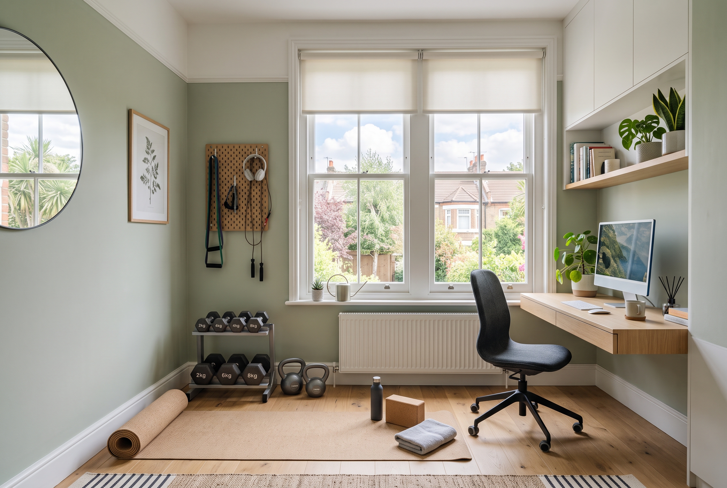
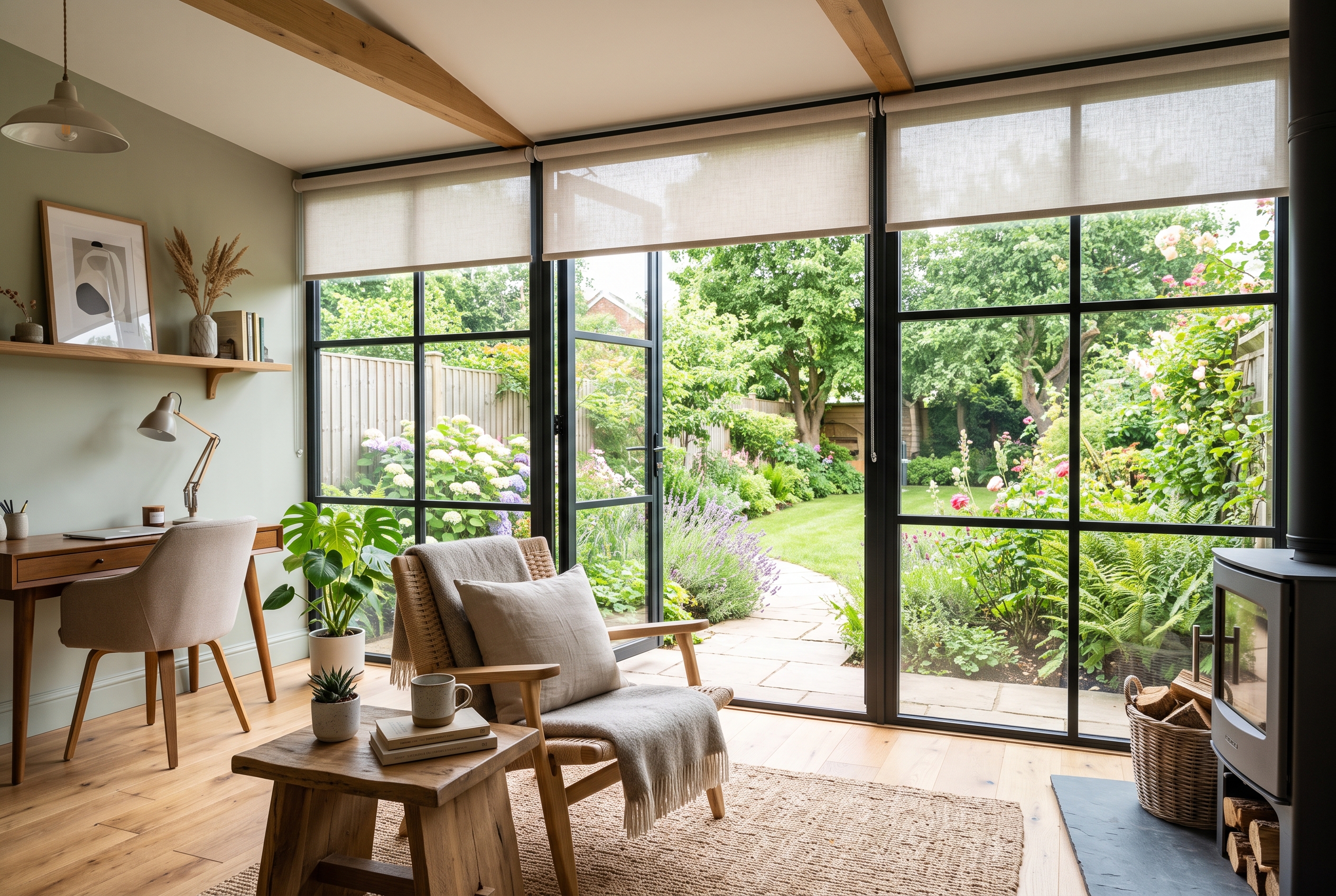
Light blinds are popular for a reason. Whites, creams, soft greys and pale natural shades reflect light and help rooms feel open. They are especially useful in smaller spaces, north-facing rooms or rooms with busy decor. A pale blind can soften the window without drawing too much attention.
Dark blinds create more drama and definition. Navy, charcoal, deep green and rich brown can look smart in larger rooms, contemporary spaces and bedrooms where a cosier feel is welcome. They can also frame a view beautifully. The trade-off is that dark blinds draw the eye, so they work best when the rest of the room can carry that contrast.
Match, contrast or coordinate?
There are three simple ways to approach blind colour. Matching means choosing a colour close to the wall or window frame so the blind blends in. This is calm, tidy and ideal for minimal schemes.
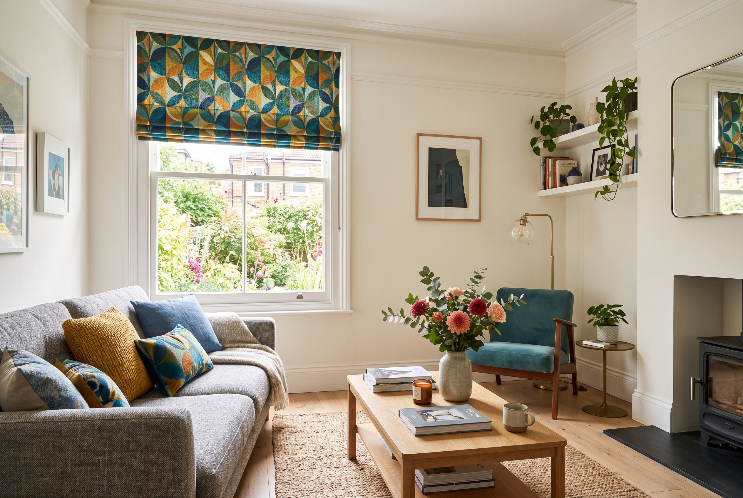
Contrasting means choosing a blind that deliberately stands out. This can look striking, especially with roman blinds, roller blinds or shutters. It works best when the colour is repeated somewhere else in the room, such as cushions, artwork, tiles or upholstery.
Coordinating sits between the two. You choose a shade that belongs to the same palette without being identical. For example, warm stone walls might pair well with oatmeal, soft taupe or natural wood. A blue sofa might be echoed with a smoky blue-grey blind rather than a perfect match.
Living rooms
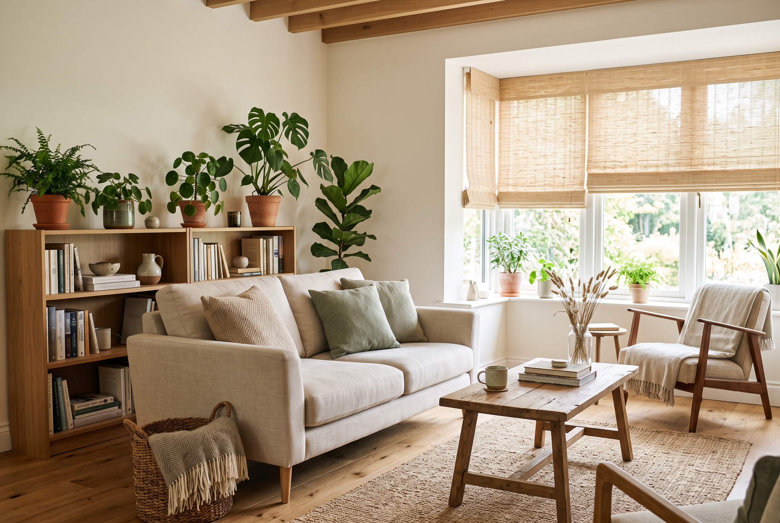
Living rooms usually need a balance of style, privacy and flexibility. If the room already has patterned wallpaper, colourful furniture or lots of accessories, a quieter blind can stop the space feeling cluttered. Warm neutrals, soft greys, natural weaves and wood tones all work well.
If the room is more pared back, the blind can add personality. A coloured roman blind, textured roller blind or painted shutter can become part of the design rather than a background detail. Just make sure the colour appears elsewhere in the room so it feels intentional.
Bedrooms
Bedrooms tend to suit colours that feel restful. Soft greens, muted blues, warm neutrals, gentle pinks and deeper cocooning shades can all work, depending on the room. If you are choosing blackout blinds, remember that the blackout lining does the light-blocking work. The front fabric can still be chosen for style.
For small bedrooms, pale blinds can help keep the room feeling airy. For larger bedrooms, darker or richer colours can add warmth and make the space feel more settled.
Kitchens and bathrooms
Kitchens and bathrooms often benefit from colours that feel fresh and clean, but that does not have to mean plain white. Soft sage, warm grey, stone, navy, muted terracotta or wood-effect finishes can all look excellent, especially when they pick up tones from tiles, worktops or flooring.
Practicality matters here. In moisture-prone rooms, the material may narrow your colour choices. Faux wood, aluminium and suitable roller fabrics are often easier to keep clean than delicate fabric finishes.
Small rooms and large rooms
In small rooms, a blind close to the wall colour can make the window feel less interrupted. This helps the room read as one continuous space. Light-reflecting shades are also useful where natural light is limited.
Large rooms can handle more contrast. A darker blind, bold colour or visible texture can help anchor the window and stop the room feeling bland. If there are several windows in one space, consider whether you want the blinds to create a rhythm or blend away quietly.
Always view samples in the room
Colours change with light. A warm beige in a showroom can look yellow in one room and grey in another. A green that looks subtle online may feel much stronger once it covers a full window. Always view samples in the room, at different times of day, before making the final choice.
It also helps to hold the sample near the window frame, wall, flooring and main furniture. The blind does not have to match everything, but it should make sense beside the biggest fixed elements in the room.
Choose a colour you will enjoy living with
Blind colour is both practical and personal. The right shade can make a room feel brighter, calmer, warmer or more finished. If you would like help choosing colours that work with your home, Lloyds Blinds can bring samples to you and talk through the options in your own light. Get in touch for friendly advice and a no-obligation quote.